Introduction
In this tutorial, we apply the Econdatar R package to demonstrate how to use the Treasury Budget data on EconData. We will create three visualisations: an area chart, a hairy line plot, and a stacked bar chart. The Econdatar package helps you streamline and automate your workflows by directly importing the latest data available on the platform.
Beneath each visualization, you’ll find an “expand to see code” option. Clicking on this will reveal the R scripts that were used to create each plot, offering a hands-on learning experience on how to reproduce these visuals.
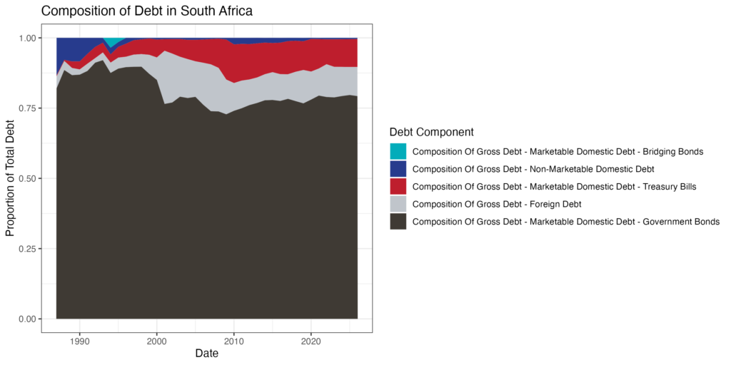
Treasury Main Budget Table 10 (Government Debt): Area chart of debt composition
expand to see code
Creating an Area Chart of Composition of Debt
In this example, we will be working with EconData’s “Treasury Main Budget: Government Debt” tables and how to use them for analysis.
Load necessary packages:
packages <- c( "tidyverse",
               "econdatar",
               "scales"
             )

invisible(lapply(packages, library, c=TRUE))
Learn how to install the econdatar package here.
Create a custom color palette for the plots (Optional):
palette <- color_list <- c("#02acba", "#273b8d", "#be1e2d", "#c0c5cb",
                           "#3F3A34", "#D8C472", "#4A4ACC", "#B3EFB2",
                           "#AA78A6", "#41E1D2", "#9a8c98", "#E8E288",
                           "#1D3461", "#F7C1BB", "#7280D9", "#EDD4B2",
                           "#FD5345", "#BFB6BB", "#306B34", "#D499B9",
                           "#C7F0BD", "#DDA448", "#F2542D", "#43AA8B",
                           "#95B8D1" )
Import all series of Table 10 (Government Debt) data from EconData
Assign the imported data to the variable debt_list.
debt <- read_dataset(id = "GOVTDEBT",
                     version = "1.0.0",
                     series_key = "N.D.",
                     release = "2024 (2024-02-21)", # This specifies the budget release of 2024
                     # The following arguments lets EconData import the data in a long tidy format
                     wide = FALSE,
                     combine = TRUE,
                     tidy = TRUE
)
The econdatar package by default imports economic and financial data as a list of dataframes, each indexed by date like a time series object. Lists in R are highly versatile, allowing for efficient storage and manipulation of complex data structures. Though, for plotting, we often require the data in a long format – and the econdatar package can do that too! The code above changes the default arguments and loads the data (and metadata) in a long and tidy format.
Prepare the Data:
First, filter the data for the subsection of Table 10 we are interested in: line items related to the composition of public debt (all Mnemonic codes starting with ‘N.D.C’). You can learn more about the Mnemonic codes in our Public Finance and Accounts User Guide.
filtered_debt <- debt %>%
  filter(grepl("N.D.C", series_key),
         !series_key %in% c("N.D.CDD", "N.D.CMD"))
Plot the data:
area_chart <- filtered_debt %>%

  # Aggregate or summarise to calculate the total contribution of each series_name
  group_by(series_name) %>%
  mutate(total_contribution = sum(obs_value, na.rm = TRUE)) %>%
  ungroup() %>%

  # Optional: Reorder based on the total contribution
  mutate(
    series_name = fct_reorder(series_name, total_contribution, .desc = FALSE)
  ) %>%

  # Create the ggplot
  ggplot(
    aes(x = time_period,
        y = obs_value,
        fill = series_name)
  ) +
  geom_area() +  # Create area chart
  scale_fill_manual(values = palette) +  # Custom color palette
  theme_bw() +  # Apply theme
  labs(x = "Date",
       y = "Proportion of Total Debt",
       title = "Composition of Debt in South Africa",
       fill = "Debt Component")
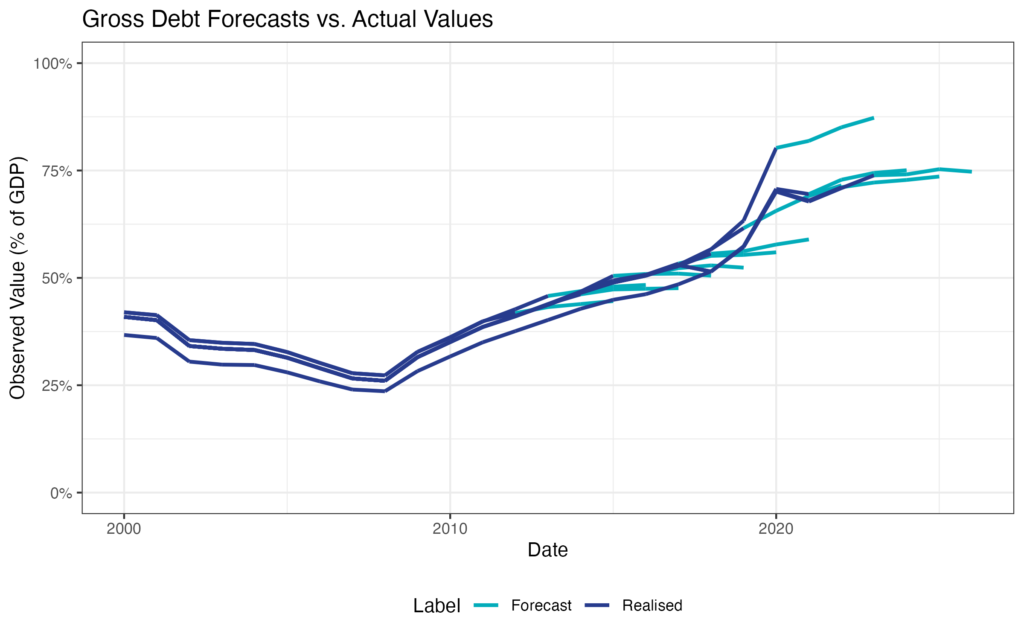
Treasury Main Budget Table 10 (Government Debt): Hairyline plot of debt over time
expand to see code
Here we will produce a hairy line plot. Hairy lines are a great way to visualise how forecasts differ from realised values over time. Here we will make use of all the available vintages (previous and current budget releases) to draw a hairy line for Gross Government Debt (% of GDP) over time.
To do this, we need to add the data vintage by vintage / release by release.
Define the releases
r <- c("2024 (2024-02-21)",
       "2023 (2023-02-22)",
       "2022 (2022-02-23)",
       "2021 (2021-02-24)",
       "2020 (2020-02-26)",
       "2019 (2019-02-20)",
       "2018 (2018-02-21)",
       "2017 (2017-02-22)",
       "2016 (2016-02-24)",
       "2015 (2015-02-25)",
       "2014 (2014-02-26)",
       "2013 (2013-02-27)")
These releases are the specific dates on which the budget data were released every year from 2013 to 2024.
Import the data:
# Loop through each release and import from EconData
total_debt <- lapply(r, function(r) {
  read_dataset(
    id = "GOVTDEBT",
    version = "1.0.0",
    series_key = "N.D.PGL",
    release = r,
    wide = FALSE,
    tidy = TRUE,
    combine = TRUE
  ) %>%
    mutate(vintage = r)
}) %>%
  bind_rows()
Plot the hairy line:
hairy_line <- total_debt %>%
  filter(time_period >= as.Date("2000-01-01")) %>%
  mutate(OBS_STATUS = ifelse(OBS_STATUS == "A", "Realised", "Forecast")) %>%
  ggplot(aes( x = time_period,
              y = obs_value,
              group = vintage, # So that we have multiple lines, each representing a vintage
              color = OBS_STATUS # To differentiate between observed and forecasted values
  )) +

  geom_line(lwd = 1) +

  theme_bw() + # general theme
  scale_color_manual(values = palette) + # here using the custom color palette

  labs(title = "Gross Debt Forecasts vs. Actual Values",
       x = "Date",
       y = "Observed Value (% of GDP)",
       color = "Label",
       linetype = "Observation Status") +

  theme(legend.position = "bottom") +

  scale_y_continuous(labels = percent_format(), limits = c(0,1)) # Format y-axis as percentages
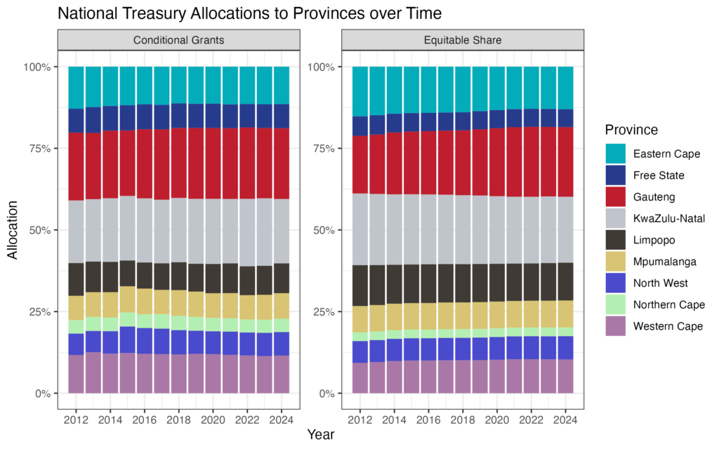
Treasury Budget Annexure AW22 (Total Transfers to Provinces): Stacked bar chart of conditional grants and provincial equitable share over time
expand to see code
In this example, we will be working with the Treasury Provincial Annexure Tables and how to conduct data analyses of them. A stacked bar chart may be used to see the evolution of allocations over time.
Import the data from EconData:
For the provincial tables, the series_key is structured as "Section"."Province"."Table+Line Item". Here we use Section “A”, All the provinces, Table “PP” and Line Items “E” and “G” (Equitable Share & Conditional Grants to Provinces).
pes <- read_dataset(
  id = "GOVTANNEX_PROV",
  version = "1.0.0",
  series_key = "A.EC+FS+GP+KN+LM+MP+NW+NC+WC.PPG+PPE",
  release = "2024 (2024-02-21)",
  # The following arguments lets EconData import the data in a long tidy format
  wide = FALSE,
  combine = TRUE,
  tidy = TRUE
  )
Plot the stacked bar chart:
stacked_bar <- ggplot(pes, aes(x = time_period, y = obs_value, group = category, fill = south_african_province)) +

  geom_col(position = "fill") + # Stacks the bars and normalizes their height

  facet_wrap(~category, scales = "free_y") + # Facet by ITEM

  theme_bw() +

  labs(
    title = "National Treasury Allocations to Provinces over Time",
    x = "Year",
    y = "Allocation",
    fill = "Province"
  ) +
  scale_fill_manual(values = palette) +

  scale_y_continuous(labels = percent_format()) + # Format y-axis as percentages
  scale_x_date(date_breaks = "2 years", date_labels = "%Y") # Dynamic date breaks every 2 years
Conclusion
There are many more dataseries from the Treasury’s budget data. This tutorial should equip you to use these sources effectively. Have you checked out EconData’s User Guide? It provides more detail on how to use EconData as well as some R programming essentials.
##EconData #Budget Review #Coding #EconData R #Public Finance Module